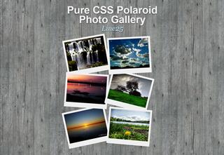
Today’s Goals:
- Use cool CSS3 features to make a nice-looking photo gallery (also review positioning, floating, and learn about z-index)
Today’s Featured Site:
- http://ismycomputeronfire.com/ and http://ismycomputeron.com/– Very important questions
- Bonus: check out the holiday desktop wallpaper available from Smashing Magazine. To pick the right size, right click on your desktop and choose “screen resolution.”
CSS3 photo gallery
- This is what you will make! Roll your mouse over the photos to see what happens.
- Tutorial link (start where it says body and #container; skip link sourcing)
- You will follow the tutorial. But first, set up a new page in Notepad++ and download the images (links below). Create a new folder on your computer just for this project. Save all of your images there:
- Remember, you need opening and closing tags for html, head, title, style, and body.
- Images: click on the link below, then right click on the image and save it to your own computer in the folder you just created. You could also just use the image links as your image source and you don’t have to download anything; your choice.
- If you’re stuck: check out this starter code or look at the demo and view the code
- Make sure to change the img src to your actual image name (don’t need images/ unless you put your images in a separate folder called images). Also, please be sure to change the alt tag to the correct description of your image.
- Finally, here is the link for photos 1, 2, 3, 4, 5: http://www.flickr.com/photos/claudio_ar/. Replace the # in your link code with that link.
- Here is the link for photo 6: https://www.flickr.com/photos/galego/3131005845/
- YOU MUST CLOSE THE LINKS AROUND YOUR IMAGES YOURSELF! Don’t forget to add the closing link tag (an a with a slash in front of it in pointy brackets) after the image name.
CSS3 Photo Gallery Code Review
- Check out the following when you’re done
- z-index (layering content and determining what’s in front, what’s behind)
- transform (how we rotated the pictures)
- box-shadow (adds a shadow, similar to the text-shadow property you’ve used before)
- Some questions:
- Why is the padding for the images 10px 10px 25px 10px? What has the largest value there (top, bottom, left, or right) and why?
- What does list-style: none do to bullets and why did we use it here?
- Why are the images floated to the left? Why are we also using relative positioning with them?
- What does ul.gallery li a.pic-1 mean?
- Why did we have to apply classes to the images (ex. class=”pic-1″)?
- Why does ul have a class of “gallery”?
