Today’s Goal:
- Use CSS display values block, inline, and inline-block to create horizontal and vertical webpage menus
Today’s Featured Site:
- https://httpster.net/2016/dec/– Get inspired by awesome websites made by people from all over the world
About the CSS Display Property
- CSS can control how individual elements are displayed on a webpage. This is another way to create a webpage layout with CSS (in addition to positioning and floating, which we have recently learned).
- We looked at block and inline display on Wednesday.
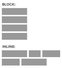
- Block elements take up as much space as they can (the full width of a page or container) and start on a new line (think paragraphs, headlines) while inline elements (the default display) only take up the space they need for the width of their content and don’t start on a new line (like images, links).
- Remember the CSS box model? Every element basically has an invisible rectangle around it that can have margins, a border, padding, background color/image, width and height. The CSS display property can control that rectangle and the inline-block value can make elements line up next to each other and respond to the styling options available for the box model (margins, borders, padding, width & height).
- Here is a good visual for inline-block.
Using Bullets to Create a Vertical Menu

- Code reference: W3Schools.com
- Open Notepad++ and start a new page. Please add opening and closing html, head, title, style, and body tags. Please save this as cssmenus.html.
- Let’s just make a simple list with 3 bullets to see how that looks. Let’s make 3 bullets and add the words Home, About, and Contact since we’re creating a website menu.
- Question: are bullets block or inline elements? How can you tell?
- Now let’s start creating a vertical menu. First, let’s add ul with curly brackets { } to our style sheet. Let’s add list-style-type: none; to get rid of the bullets (where else have we recently done this?). Let’s also add margin: 0; and padding: 0; to override the browser’s default settings for those.
- Now it’s time to add some properties to our bullets to make this look more like a vertical menu. Let’s add li with curly brackets { } in the style sheet and put width: 60px; and background-color: lightblue;.
- Questions: Why are we able to add a width and background color to our li? Hint: yesterday we learned that which display value (block or inline) allows us to add CSS box model properties (margins, border, padding, width, height, background color) to our element?
- Question: How could we add a border to the menu?
- Our menu still isn’t very exciting. Let’s fix that by adding links and some additional styling so we have a hover effect when pointing our mouse to a menu item.
- First, make a link around Home, About, and Contact. Just use # as the link source.
- Since we’ve added links to our menu, we need to add them to our style sheet so we can style them. Let’s add a next to li in the style sheet so it looks like li a.
- Delete the width line in li a and add width: 200px; under ul. Let’s also cut and paste the background-color line from li to ul.
- Let’s add some styling to li a. Add text-decoration: none; to get rid of the automatic underlining of our links. Add padding: 8px 16px; (why are there only 2 values here and what do they mean?)
- OK, this looks a little weird. We learned earlier that bullets are block elements. However, we’ve add a link, which is an inline element. How can we change the display of our li a so that we can fix the styling issue we’re having?
- Finally, let’s make the color change on the menu when we hover a mouse over the text. Add li a:hover and some curly brackets { } to your style sheet below li a. Add background-color: pink;
- Question: How could you center the text?
Using Bullets to Create a Horizontal Menu

- Comment out your entire style sheet by adding HTML comment tags around your style tags in your head section. Then, add new opening and closing style tags right below the ones you commented out. We’re doing this to keep our former CSS as a reference and so we can easily add some new CSS.
- Let’s begin in the same way as the vertical menu. Add ul with some curly brackets inside the style tags and add list-style-type: none; margin: 0px; and padding: 0px;. Also add width: 400px; and background-color: lightblue;
- Add li to your style sheet below ul. We have to change the display of our li so we can create a horizontal menu. If bullets are block elements, then what should we change the display to, block or inline?
- Let’s also add padding: 8px 16px; under li.
- We need to style the links inside our menu. Add a with curly brackets { } to the style sheet below li. Add text-decoration: none; to remove the underline. Add padding: 20px;. We must add display. Here is where inline-block comes in handy. Adding display: inline-block; to our links means we can have them line up next to each other while also styling them to look like a menu.
- Finally, let’s add border-right: 1px solid blue; under li. You can also have border-top, border-bottom, and border-left. Very useful!
- Question: How can we add the same hover color effect that we had with our vertical menu?
- Questions: How can we get rid of the extra space at the end of our menu? What happens if we get rid of the width? Why?
Challenge: See if you can add the right code to create a drop-down menu.
