Today’s Goals:
- Continue creating responsively designed webpages
- Learn about CSS media queries and how to use them to create responsive webpages
Today’s Featured Site:
- http://khaledipsum.com/– Instead of using the more traditional Latin gibberish that web developers use (Lorem ipsum dolor…), use DJ Khaled when you need to use place-holder text.
Creating Responsive Webpages: Some Approaches
- Responsive web design is the act of making your webpage look good on a variety of screen sizes. There are many different ways to create a responsively designed webpage. We are going to look at a couple today and learn a few particular methods and frameworks over the next few weeks. There are many tools and approaches to help create a responsively designed site, some of which you will learn.
- Please download this code, open a new Notepad++ file, copy and paste the code there, and save it as responsive1.html.
- Auto height and width (default for block-level items when dimensions not specified). What happens to text box when we use this? Let’s shrink the browser window to do a responsive test.
- Width percentages– what does this mean for different containers or screen sizes? What happens when we change our width and top values to percentages? Why? Again, let’s shrink the browser window to do a responsive test.
- CSS media queries– let’s first watch this video.
- Before we work with the code based off of the video, let’s do a quick sketch. In the video, we saw four boxes containing an image and some text shift around as the screen size grew and shrunk. Think about the four boxes and how much space they take up percentage-wise as the screen gets bigger or smaller. Let’s draw them at 100%, 50%, and 25%.
- Let’s work with some code based off of this video. Click here to download your code.
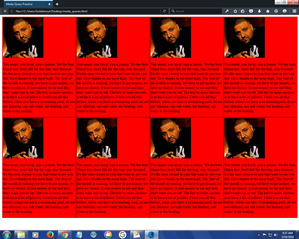
- Open a new Notepad++ page, copy and paste the code, save it as khaled.html, and then launch it in the browser. What happens when you resize the browser window? What do the media queries say?
- Let’s open the page in Firefox and go into Responsive Design Mode. Let’s check out the page just before it hits 500px and 900px. What happens? Why?
- Let’s add some more media queries. What should happen if we design for a smaller screen? What about a larger one?
- Can you add other CSS style properties to the separate media queries? Let’s try adding background colors to each media query.
- What would happen if we add more boxes to our page? Let’s try it.
