Today’s Goals:
- Continue working with CSS media queries to make our DJ Khaled page responsive
- Change seats!
- Receive grade
Today’s Featured Site:
- http://orangeyouglad.com/– A well-designed site that is also responsive!
Grades:
CSS Media Query Practice
What we are doing to our page: We are going to change up our original DJ Khaled page by adding a header, footer, and sidebar menu. We are going to add new CSS for different media queries to change how our page looks on different screen sizes.
Important new code:
header– located at top of page, width 100% for each screen
footer– located at bottom of page, width 100% for each screen
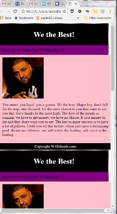
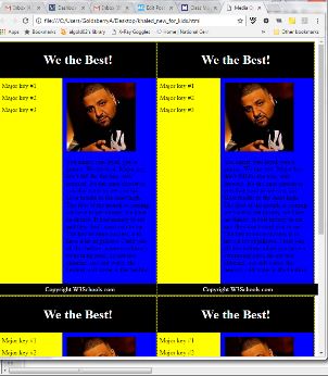
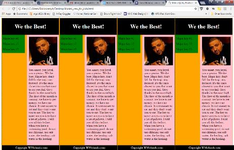
nav– contains the Major Keys and is the page menu. Nav is 100% width on the smallest screen (320px) and is a horizontal menu across the top below the header and above the section. Nav then becomes a sidebar for the 600 and 1100 pixels screens, so its width changes to a smaller percentage and it is floated to the left so it will be next to section. The nav’s menu items go from being horizontally displayed to vertically displayed on the larger screens.
section– contains picture and text. Section is 100% width on the smallest screen (320px) and then floats to the right so the nav can fit next to it on the larger screens.
Create new CSS for each media query. Work at your own pace and please help each other out! Here is the starter code in case you make a mistake and need to go back.
- Let’s look at the page in Firefox with Responsive Design Mode and see what happens at our different break points of 320px, 600px, and 1100px. Does this page look good at each size? Why or why not?
- What do we have to change for each media query? Why?
- Let’s begin with the smallest screen, 320px. Let’s change nav, li, and section for this media query. Our nav should have width: 100%;, background-color: purple; box-sizing: border-box; float: none; and clear: right;. Our li should have display: inline; (why?). Our section should have width: 100%; background-color: pink; and float: none;. Why are we changing the CSS in this way?

- Now let’s change the rest of our CSS. As our screen size grows, we can have our menu (nav) move from the top of our page to a sidebar. Let’s begin with the next screen, 600px. Our nav should have background-color: yellow; and width: 35%; (why?). If we want our nav to appear in a sidebar on the left, how should we float it? Let’s add background-color: blue; to section and width: 55%;. How should we float section if we want it next to nav? Finally, we need our Major Keys to display vertically, not horizontally. What should we change the display of li to?

- Time to finish with the 1100px media query. Let’s change the background color of nav to green and the width to 40%. Let’s change the background color of section to pink and the width to 50%. Why don’t we have to float these sections? Why don’t we have to do anything with li?

- Finally, let’s look at this updated page in Firefox’s Responsive Design Mode.
- Why did we keep our header and footer the same for each screen size?
- Look at what happens to our webpage when we go below 320px. How could we fix this?
