Today’s goal:
- Create a responsively designed webpage with a Valentine’s Day theme
Today’s featured website:
- http://metrocosm.com/us-immigration-history-map.html– This cool site provides a great visualization of immigration to the US over 200 years
Valentine’s Day Design Challenge
- Challenge: Can you make a one page webpage that looks like your card and/or piece of candy?
- Steps
- Pick a card and piece of candy.
- Really look at the card and candy in detail. Observe the design, colors, characters, text, etc. Think about the colors and images you will want to use in your design. What will your theme be? What will your message be?
- Create your own RESPONSIVE page from scratch OR pick a responsive template to use. Read the comments to see what to change! You will also need to fill in the media queries.
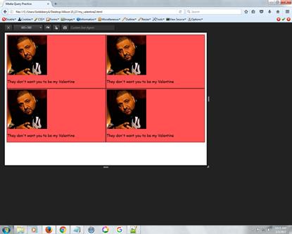
Similar to our DJ Khaled page, looks like little mini cards to cut out

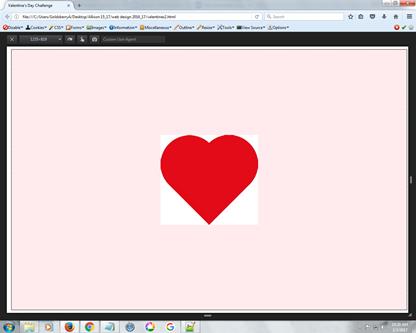
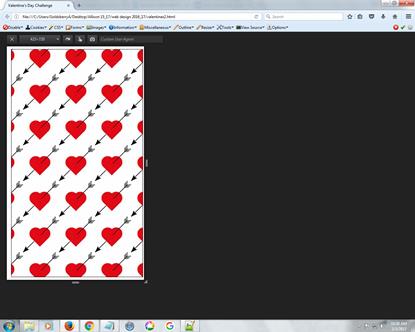
Download this code template; MAKE SURE TO READ COMMENTS!This page has 2 background images, one for a large screen and one for a small screen


Download this code template; MAKE SURE TO READ COMMENTS! - Find colors for your page that are similar to your card and/or candy. See the color resources below to help.
- Find images for your page that are similar to your card and/or candy. See the image resources below.
- Start making your page. When you think you’re done, get a second opinion! Then revise.
- Resources
- Examples from last year (not responsive; project was different): This, this, and this. Those are only screen shots; each one was animated and used Animate.css (optional).
- Border styles: dotted, dashed, solid, double, groove, ridge, inset, outset
- Text-shadow: See the sample code here.
- Colors:
- Animate CSS– add the style sheet to your head section (see this class post as a refresher) and then check out the different options here. Remember to add the animation as a class.
- Fonts: Google Fonts- go to the site or here for the directions
- Images: https://unsplash.com/, https://www.pexels.com/, or Bing.com (do image search, then search for free to share and use)
- CSS cheat sheet: CSS you need to know in one place
- More CSS help: By property
Checklist for Success
- Make sure you do the following to end up in the “wildly successful”, A-range category.
- Wildly successful (A range):
- Completed webpage
- Images came from sources listed above
- Strong, obvious attempt to create an appealing visual theme
- Images chosen and resized carefully to go along with visual theme and to be as visually appealing as possible; colors used go along with visual theme
- Text is easy to read and goes along with theme (font, color, and size)
- A new font is used
- Moderately successful (B/C range):
- Completed webpage
- Images came from sources listed above
- Images somewhat appealing; evidence of some attempt made to create visual theme.
- Text is somewhat hard to read; lacks a new font; use of color or size somewhat effective
- Not so successful (C or lower range):
- Incomplete webpage
- Little effort put into creating visual theme
- Images from sources other than those listed
- Text is hard to read; no new font is used; little attention paid to use of text color and size in theme

2 thoughts on “Valentine’s Day Design Challenge”
Comments are closed.