Today’s goals:
- Review the Do’s for good website design (from Monday)
- Begin talking about mobile design and responsive design
- Compare user experiences for doing things with a phone and a laptop
- Examine responsive webpages
Today’s featured website:
- http://metrocosm.com/us-immigration-history-map.html– This cool site provides a great visualization of immigration to the US over 200 years
Mobile design
- Questions to explore:
- What is mobile design?
- Why is it important?
- Let’s list of as many devices as you can that would access a website (types of devices and names, like MacBook Pro or Windows Phone).
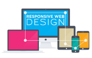
- What is responsive web design?
- Is www.medfordpublicschools.org responsive? How about www.medfordma.org? How can we tell?
- What are some ways (i.e. tools, methods or frameworks) to make a website “mobile-friendly” (i.e. be responsive or look good on a variety of different screen sizes)?
- What does responsive design look like? Let’s check out some examples here and here
- Quick test for responsiveness of site- let’s check some website and resize the browser window.
- What happens when you adjust the screen size?
Phone vs Laptop
- Working in teams of 2 at your tables, you will do the following with each device (a phone and a laptop). Take note of what you have to do for each task.
- Take a photo of something
- Email the photo to me (agoldsberry@medford.k12.ma.us)
- Go to the city website and find out what meetings are taking place next week
- Go to the school website and see what’s for lunch Monday
- Find out what tomorrow’s weather will be
- Do a Google search for cute dogs
- If you have an account, begin the steps to post something to Instagram or Snapchat (you don’t actually have post something; just take note of the steps to do so on both your phone and computer)
- If you have an account, begin the steps to post something on Twitter or Facebook (again, you don’t actually have post something; just take note of the steps to do so on both your phone and computer)
- Play a game
- Watch a short video
- Play a song
- Check out the news from The New York Times
- Open a Google doc
- Let’s talk about the differences with each approach and the advantages and disadvantages of each of the devices in doing each activity. Which device do you prefer for which particular activity and why?
Responsive website examples
- In teams of 2 at your tables, you will be asked to examine the 3 websites below on your phone and on your laptop. Write down all of the differences you notice when you view the site on your phone and on your laptop. Differences could include changes in the layout, menu appearance, images or videos, etc.
- https://www.tayburn.co.uk/
- https://codepenworldsfair.com/
- https://www.dallasartfair.com/
- Open Firefox and go to the first website (then do the other 2). Click on the 3 vertical lines (the hamburger) in the top right corner of Firefox. Go to Developer, and then responsive design mode. Drag around the bottom right corner of the box to see the changes to your website as the screen shrinks and grows. Try to figure out at what pixel width the design changes.
- Now go to each of the 3 websites on your phone. What differences do you notice between looking at the websites on your phone and on your laptop?
