Today’s goals:
- Examine responsive webpages
- Learn about different approaches for responsive web design
- Begin learning about CSS media queries
Today’s featured website:
- http://gameofcanada.com/– A creative and well-designed site for Game of Thrones fans. Is it responsively designed? How can you tell?
Examine Responsive Webpages
- In teams of 2 at your tables, you will be asked to examine the 3 websites below on your phone and on your laptop. Write down all of the differences you notice when you view the site on your phone and on your laptop. Differences could include changes in the layout, menu appearance, images or videos, etc.
- https://www.tayburn.co.uk/
- https://codepenworldsfair.com/
- https://www.dallasartfair.com/
- Open Firefox and go to the first website (then do the other 2). Click on the 3 vertical lines (the hamburger) in the top right corner of Firefox. Go to Developer, and then responsive design mode. Drag around the bottom right corner of the box to see the changes to your website as the screen shrinks and grows. Try to figure out at what pixel width the design changes.
- Now go to each of the 3 websites on your phone. What differences do you notice between looking at the websites on your phone and on your laptop?
Creating Responsive Webpages: Some Approaches
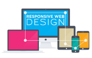
- Responsive web design is the act of making your webpage look good on a variety of screen sizes. There are many different ways to create a responsively designed webpage. We are going to look at a couple today and learn a few particular methods and frameworks over the next few weeks. There are many tools and approaches to help create a responsively designed site, some of which you will learn.
- Use the auto value for width and height. What happens when we do this? What determines the width and height when the value is auto?
- Use percentages for margins and width/height values. Why would this approach be more responsive than using pixels (example- width: 50% vs width: 300px)?
- Media queries: changing CSS styles at certain screen widths. Things to consider: when does your design break? What CSS style changes can be made to adjust for certain screen widths? Common changes include the page layout, menu design, and background images.
- Frameworks: We will look at Skeleton and Bootstrap. What are these? Why do people use them?
- New: CSS grid layout.
CSS Media Queries
- CSS media queries are used to change CSS styles when the screen (or view port) is a certain width. Screen/view port sizes are selected by determining when a design “breaks.” For example, in the Dallas Art Fair site we looked at, a video was used as a background for larger view ports, such as computer screens, and an image was used for smaller view ports. Media queries can be used to change a background image, page layout, or menu design (among many other things) when these things don’t look right at certain view ports (such as a video background image on a small screen such as a phone).
- Practice code: Download your code here
- Open a new Notepad++ page, copy and paste the code, save it as mediaqueries.html, and then launch it in the browser. What happens when you resize the browser window? What do the media queries do?
- Let’s open the page in Firefox and go into Responsive Design Mode. Let’s check out the page just before it hits 500px and 900px. What happens? Why?
- Why does the box still float to the left when the screen size hits 900px and above?
- Let’s add some more media queries. What should happen if we design for a smaller screen? What about a larger one? Specifically, what width should the box be?
- Can you add other CSS style properties to the separate media queries? Let’s try adding background colors to each media query.
- What would happen if we add more boxes to our page? Let’s try it.
