Today’s Goal:
- Learn about information architecture
Today’s featured website:
- http://destroyer.la/– You can do a surprising thing with your spacebar on this website after you scroll to the bottom
What is Information Architecture?
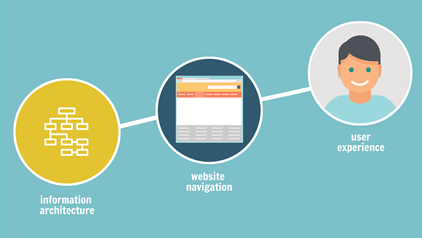
Basically, how to organize the content on a website:
– main menu and sub-menu items
– how many pages
– what goes on the home page
– page topics
– how content is organized on each webpage
– how users can search for information
Key concepts
– cognitive load the amount of information a person can process at any given time; don’t overload a user with too much information at once
– mental models the assumptions people make about how a website should look/function; for example, people expect to be able to get back to the home page by clicking an image or button at the top of the webpage
– decision making put yourself in the user’s shoes and help them make decisions by giving them critical information at key moments
– audience who is using your site? what are their goals?
– your site’s goals what is the purpose of your website? (informational, educational, entertainment, selling, etc.)
– simplify! how can you make your site as simple to use as possible?
It’s common and helpful to create a site “wireframe,” which is a basic sketch of the home page, navigation, potential subpages, and other key content (header, footer, sliders, videos, photos) that will be used to organize the site’s content and to guide users through the site.
Activities
1. Review a website
Choose a site you like and look at the following: the site’s main menu, the site’s submenu, the site’s pages (a few of them), and where to search for content
Questions:
– Was the main purpose/goal of the site clear?
– Is the site well organized? Why or why not?
– Could you get from any page of the website back to the home page?
– Did the site’s organization “make sense?”
– Was it easy to search for content?
– Was the main menu located on every page?
– Was the site missing something you expected to be there?
2. Organize a website
Imagine you’ve been asked to create a website for a new restaurant that’s opening next month in Medford! How would you organize the site?
Questions:
– What would be on the home page? Why?
– What other pages would you need? Why?
– What would you include in the website menu (navigation, not food)? Why?
3. Improve a website
What are the organizational problems with these sites? How could they be improved?
– http://art.yale.edu/Home
– http://paradisewithaview.com/
– http://best-electronics-ca.com/
4. Examples
Find an example of either: a site with good information architecture or one with bad
Why did you choose this site?
