Today’s goals:
- Learn about different approaches for responsive web design
- Begin learning about CSS media queries
Today’s featured site:
- https://photos.icons8.com/creator – Create your own stock photos!
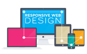
Creating Responsive Webpages: Some Approaches
- Responsive web design is the act of making your webpage look good on a variety of screen sizes. There are many different ways to create a responsively designed webpage. We are going to learn a few particular methods and frameworks over the next few weeks. There are many tools and approaches to help create a responsively designed site, some of which you will learn.
- Use the auto value for width and height. What happens when we do this? What determines the width and height when the value is auto?
- Use percentages for margins and width/height values. Why would this approach be more responsive than using pixels (example- width: 50% vs width: 300px)?
- Media queries: changing CSS styles at certain screen widths. Things to consider: when does your design break? What CSS style changes can be made to adjust for certain screen widths? Common changes include the page layout, menu design, and background images.
- Frameworks: We will look at Skeleton and Bootstrap. What are these? Why do people use them?
- New: CSS grid layout and flexbox layout
- Mobile first: the approach of designing your site first for a small screen and scaling up.
- Website vs mobile apps: what is the major difference between websites and mobile apps?
CSS Media Queries
- CSS media queries are used to change CSS styles when the screen (or view port) is a certain width. Screen/view port sizes are selected by determining when a design “breaks.” For example, in the Dallas Art Fair site we looked at, a video was used as a background for larger view ports, such as computer screens, and an image was used for smaller view ports. Media queries can be used to change a background image, page layout, or menu design (among many other things) when these things don’t look right at certain view ports (such as a video background image on a small screen such as a phone).
- Practice code: Download your code here
- Open a new Notepad++ page, copy and paste the code, save it as mediaqueries.html, and then launch it in the browser. What happens when you resize the browser window? What do the media queries do?
- Let’s open the page in Firefox and go into Responsive Design Mode. Let’s check out the page just before it hits 500px and 900px. What happens? Why?
- Why does the box still float to the left when the screen size hits 900px and above?
- Let’s add some more media queries. What should happen if we design for a smaller screen? What about a larger one? Specifically, what width should the box be?
- Can you add other CSS style properties to the separate media queries? Let’s try adding background colors to each media query.
- What would happen if we add more boxes to our page? Let’s try it.
- If we have time- download the NEW practice code and review it before we work with it tomorrow. We are going to change up our original DJ Khaled page by adding a header, footer, and sidebar menu. We are going to add new CSS for different media queries to change how our page looks on different screen sizes. Save as responsive2.html.