Today’s goal:
- Learn how to create a layout for a webpage using CSS grid
Today’s featured site:
- http://www.wonder-tonic.com/geocitiesizer/ – Make any website terrible right now!
What is CSS Grid?
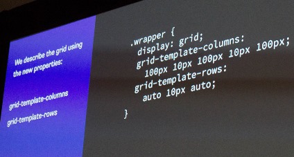
- CSS grid is used to create responsive webpage layouts by organizing content into columns and rows
- Overview: https://www.w3schools.com/css/css_grid.asp
- Sites using grid layout:
Let’s look at these in Responsive Design Mode in Firefox
https://www.niagarafallsusa.com/
https://gridbyexample.com/
http://www.gridexamples.com/ (collection)
https://www.cssdesignawards.com/website-gallery?feature=grid (collection)
https://codepen.io/collection/DQvYpQ/ (collection)
As you can see, sites using grid layout don’t have to look like actual grids!
CSS Grid Practice
- Working with me or at your own pace, you will complete exercises on Free Code Camp (through “Use grid-area Without Creating an Areas Template”).
- Let’s look at a basic grid layout with a header, footer, menu, and main section. Click to download this code and we will review it together. Keep this code for your future reference! There are two different ways to set up the same basic layout in this example. There are lots of comments in this code!
