Today’s goal:
- Practice making responsive, mobile-friendly webpages with media queries, CSS grid, and flexbox
Today’s featured site:
- https://www.webdesignerdepot.com/ – A useful site with lots of tips and resources for web development
Responsive Web Design Challenge!
Objective: use what we’ve recently learned about responsive web design approaches to create mobile-friendly webpages. You will practice using media queries, CSS grid, and flexbox.
Must-do Challenges (do all 4)
Download the code for each challenge and read the instructions in the comments. Let me know when you’re done so I can check your work.
- Perfectly center an element using flexbox– download practice code
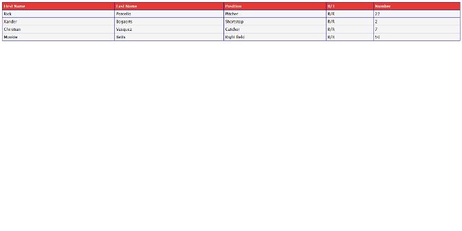
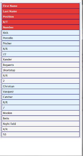
- Make this table with a partial Red Sox roster responsive by using a media query– download practice code
- Use a media query and flex box to change a large background image and font size for a small screen- download practice code
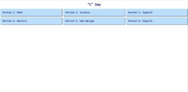
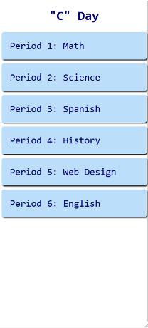
- Use CSS grid and a media query to make this student schedule look good on all screen sizes- download practice code
Other Challenges (pick 1)
- Create a responsive photo gallery using CSS grid or flexbox
- Re-design an entire page or a section (like the menu or another piece) of your personal webpage project to make it more responsive using media queries, flexbox, and/or grid.
- Use Google Docs or Slides or create a webpage that teaches someone about media queries, grid, and flexbox. Explain what they are, why they are used, how to use them, when to use them, and add images or screenshots to go along with your explanations.
- Use paper templates to create a webpage for a small screen first, then a larger screen. Your webpage must include a menu that looks different on each screen! Maybe re-create your personal webpage project or re-create a site you really like.
- Do anything you want with media queries, grid, or flexbox (you can combine them if you want)
Code Help & Cheat Sheets
Correctly Completed Pages Screen Shots:
Challenge #1- centered box with flexbox
Challenge 2- responsive table with Red Sox roster
Challenge 3- large background image problem
Challenge 4- student schedule grid




One thought on “Class Monday, March 25, 2019”
Comments are closed.