Today’s goals:
- Review what you said about responsive web design
- Learn about CSS frameworks
- Start learning about Bootstrap, a very popular web development framework
Today’s featured site:
- https://www.kapwing.com/museum-of-websites – This website gallery shows how sites of famous internet companies have changed over time.
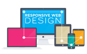
Responsive Web Design in your Own Words
I was inspired by some of your responsive web design presentations and your answers to the survey, so I decided to create a presentation that includes your definition of responsive web design and the most important things you’ve learned: https://docs.google.com/presentation/d/10L6v_4fdVrPKuha5_0vw3SFvfXynZEyMlYe2RqKwXoI/edit?usp=sharing
CSS Frameworks
Questions
- What are CSS frameworks?
- Why do people use them?
- Find CSS frameworks that are currently popular
- Find sites created with CSS frameworks
- What are some advantages of using a framework?
- What are some disadvantages of using a framework?
- How do you pick a framework?
Bootstrap
Basics
- Very popular responsive front-end framework created and maintained by Twitter
- Flexible grid built on flexbox (columns add up to 12)
- Built-in CSS for grid layout, buttons, menus, lists, etc.
- CSS classes are applied to HTML elements to make use of Bootstrap’s default styles for layout, visual design, etc.
- Built-in JavaScript for things like photo slideshows, pop-up windows, etc.
- Extensive documentation and code samples to help developers get started quickly and easily
- To use Bootstrap, you can either download all of the files OR link to the supporting CSS and JavaScript files
- Bootstrap examples: https://getbootstrap.com/docs/4.3/examples/
Tutorials
- Bootstrap basics #1- page set up, HTML tags, and CSS classes: Let’s try this basic Bootstrap tutorial . Let’s pay attention to what files are need to make Bootstrap work and the HTML tags and CSS classes used.
- Bootstrap basics #2- column classes and their sizes: Bootstrap provides options for page layout on small, medium, and large screens. You can simply choose to have your content stack vertically on small screens or you can preserve your horizontal layout on a small screen by using the xs class like this . Let’s get rid of the xs classes except for the last row and see what happens.
- Let’s look at the page you’re going to create and review the content in each section: https://www.w3schools.com/bootstrap/trybs_theme_band_full.htm