Today’s Goal:
- Continue learning CSS layout: floats
Today’s featured site:
- https://bruno-simon.com/ – Check out this fun and engaging portfolio site!
CSS Layout Review & Key Concepts:
- What are the three CSS layout methods we’ve learned so far?
- There are several different ways to use CSS to lay out your webpage and organize content. We are looking at the most basic ones and will end up focusing on mobile-friendly layout techniques to create responsive websites that adjust to fit different screen sizes.
- Coming up: display property; flexbox layout, grid layout, media queries
CSS Floats

- About:
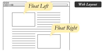
In addition to using positioning properties, we can float content to the left or right and control how the other content flows around it. However, CSS floats are not being used as much for webpage layout in favor of more mobile-friendly layouts. Floated content is also removed from its parent container, so the clearfix hack is used to address that issue. - Examples:
Let’s check out these examples: https://www.w3schools.com/css/css_float.asp
Live sites:
bostonglobe.com/– stories
amazon.com– left menu
walgreens.com– top menu - To do:
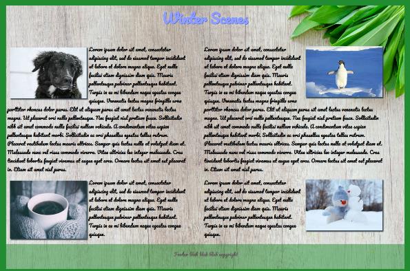
- You’re going to create the image above! You will need to float the text, images, and footer correctly.
- Download this starter code and copy/paste into a new Notepad++ file. Save as winterfloats.html.
- Read the CSS comments and begin at line 56. You will need to set up a #left section. Start by adding #left in your CSS. Add float: left; width: 45%; padding: 3px; and margin-left: 2px;
- Now set up a #right section. Start by adding #right in your CSS. Add float: right; width: 45%; padding: 3px; and margin-right: 5%;
- Both the #left and #right sections will contain text and images (see image above). The images in those sections are also being floated so the text will wrap around the images. This is one of the most useful applications of the float property- wrapping text around images.
- Now set up the footer section, which is at the bottom of the page below the content. Add clear: both; width: 100%; padding: 3px; background-color: #228c32; opacity: 0.5; and text-align: center;. We need to add clear: both; so our footer will clear the left and right sections from both directions.
- Now fill in the correct ID’s in the HTML in the body section. Look for the # before a selector in your CSS to find the correct ID names. Consider what should be first (see the image for what’s at the top of the page) and notice that the dog and mug images are on the left and the penguin and snowman images are on the right. This will help you fill in the ID names in the correct order in the HTML. Hint: read image file names.
- Make sure to close all of your div tags!
- Extra credit #1: We used placeholder text (gibberish) for our paragraphs just so we would have some text to work with. What language is it written in?
- Extra credit #2: What are the 2 descendant selectors that we used in this code? What did they do and why did we use them?
