Today’s Goals:
- Find good and bad examples of website navigation
- Complete a self-guided review of CSS
- Start learning about flexbox layout
Today’s featured app:
- https://namasketch.com/ – This site creatively teaches you some basic yoga poses
Website Navigation
- Website menus created by styling bullets:
Let’s take another look at these examples . There are several ways to create different vertical and horizontal website menus. These go beyond the basic stuff we just did. - Menus with drop-downs:
Finally, let’s look at how to create a drop-down menu - Questions:
Why is website navigation important?
Where do you usually find it?
Does navigation look different on small screens vs large screens? How? - Live examples:
The good
My example: https://www.heytempo.com/
Your examples (each person find one)
What is important for good navigation?
The bad
My example: https://www.webbyawards.com/winners/2019/
Your examples (each person find one)
What makes this navigation hard to use?
Self-guided reviews
- You will spend time on any of the following topics you feel as though you need to review. Click on any of the following links:
- Box model
- Positioning
- Floats
- Classes, IDs, and div tags
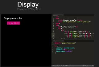
- Display, block, inline, inline-block
- Selectors, properties, and values
- HTML and CSS comments
- Don’t see what you’re looking for? Try w3school.com’s CSS tutorials.
Flexbox Layout:
- Start looking at CSS flexbox, a layout method used to create responsive (mobile-friendly) websites”
- Play Flexbox Froggy to learn some of the flex properties while helping out some frogs
- See the what the flexbox properties do by selecting different options here:
http://the-echoplex.net/flexyboxes/
