Today’s goal:
- Create an infographic, interactive image, or collage to promote May’s Harvest of the Month, seeds
Harvest of the Month digital media promotion
- You’re going to create images for the school webpage and social media to promote the school lunch program’s Harvest of the month
- Where your stuff will go: school webpage, school/city Facebook, school/city Twitter
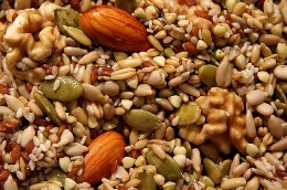
- May’s Harvest of the Month is seeds. Today school nutritionist Retta Smith is visiting us and she’s bringing “energy balls” for us to sample!
- Working in teams of 2 at your tables, choose 1 medium to work with today:
- infographic (sign up for free account)
- interactive image (sign up for free account)
- collage (no account needed)
- Get images:
- https://unsplash.com/
- https://www.pexels.com/
- Bing.com (do image search, then search for free to share and use)
- Seed facts to potentially include:
- Where our seed-based products are from (name of local farm or region/state)
- When they’re being served and/or what is being served. May 26- sunflower seed and local oats “energy ball”
- Info from the Harvest of the Month website
- Popular recipes (title and maybe a link to a recipe)
- Nutritional benefits (make sure to cite your source)
- Details from Ms. Smith’s presentation
Checklist for Success
- Make sure you do the following to end up in the “wildly successful”, A-range category.
- Wildly successful (A-range):
- Models: this infographic, this infographic, this interactive image, and this collage
- Completed collage, infographic, or interactive image
- Images came from sources listed above
- Strong, obvious attempt to create an appealing visual theme
- Images chosen carefully to go along with visual theme and to be as visually appealing as possible
- Text information included is helpful and descriptive, and includes dates served, nutrition facts, and origin of the local produce.
- Text is easy to read
- Moderately successful (B/C-range):
- Completed collage, infographic, or interactive image
- Images came from sources listed above
- Images somewhat appealing; evidence of some attempt made to create visual theme.
- Text information included is helpful and descriptive, but doesn’t include everything listed in the wildly successful model.
- Text is somewhat hard to read
- Not so successful (C or lower-range):
- Incomplete graphic
- Little effort put into creating visual theme
- Images from sources other than those listed
- Minimal text that provides little information
- Text is hard to read
