Today’s goals:
- Finish CSS Quote project
- Learn how to create color gradient backgrounds using CSS
Today’s featured website:
- http://roblafratta.com/mariowario– CSS is used to create fun superhero costumes for Mario!
CSS Gradient Background
1. View gradient backgrounds on different websites
- See this site for several examples
2. Download starter code and create new Notepad++ page
- Download this code to begin and copy and paste it into a new Notepad++ page. Save it as cssgradient.html
3. Launch your page
- Your very first gradient is a basic linear gradient that goes from the top to the bottom, with the second color, blue, last.
4. Linear gradient- change the colors
- Change the colors from red and blue to something else (get colors http://htmlcolorcodes.com/color-names/). Add a 3rd, 4th, and even 5th color. What happens?
5. Linear gradient- change the direction
- Add background: linear-gradient(to right, COLOR, COLOR); and try different colors as well as: to left, to bottom right, to bottom left, to top right, and to top left. Make a rainbow- background: linear-gradient(to right, red,orange,yellow,green,blue,indigo,violet);
6. Linear gradient- change the angles
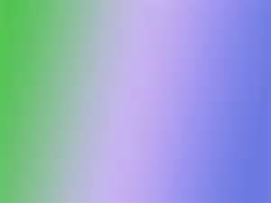
- The basic vertical linear gradient is top to bottom, 180deg. Try background: linear-gradient(45deg, red, blue); and then change the angle to different numbers besides 45deg. Again, change the colors up! Try using colors that are close together (like different shades of blue) to see a more subtle gradient effect. Find colors: http://htmlcolorcodes.com/color-names/. Challenge: can you create the gradient that is used as the featured image on our class website above? Hint: you will need 3 colors, green, light purple, and dark purple, and an angle close to 90deg.
7. Radial gradient- change the colors
- Create your first radial gradient by adding background: radial-gradient(green, purple);. Try changing the colors and adding at least one more color to see what 3 colors together looks like.
8. Radial gradient- change the shape
- The default shape for a radial gradient is an ellipse. Make it a circle by adding background: radial-gradient(circle, green, purple);
9. Radial gradient- change the amount of color
- You can choose how much of each color you want background: radial-gradient(red 5%, yellow 15%, green 60%);. Change the colors and the percentages to get different results.
10. Happy Halloween!
- Create a gradient background with a spooky Halloween vibe. Choose any kind of gradient you want using the examples above. Style your h1 headline with CSS to give it a font-size, text-align, color, and font-family. Choose a Google Font. Don’t forget to add a text-shadow (text-shadow: 2px 2px black;) – just change the pixel values and color if you want.

One thought on “Class Thursday, October 26, 2017”
Comments are closed.