Today’s Goal:
- Review responsive design
- Introduction to Skeleton, a style sheet that can be used to make websites responsive
Today’s featured website:
- https://www.mobify.com/insights/70-stunning-responsive-websites-for-your-inspiration/– A gallery of responsively designed websites
Responsive Web Design Review
- Responsive web design is the act of making your webpage look good on a variety of screen sizes. There are many different ways to create a responsively designed webpage. There are many tools and approaches to help create a responsively designed site, some of which you will learn in this class.
- We’ve already practiced used CSS media queries to create responsive webpages. How do media queries work? What do they do?
Getting started with Skeleton
- About
- What is it?
- Why use it?
- Let’s look at this sample site, Skeleton’s website and code
- This site was built with Skeleton- how many columns do you see? How about this site? What happens when we shrink the browser window?
- Questions
- Why is a grid design helpful for making a website responsive?
- What is important about the number 12?
- What are the media queries based upon?
- What is an external style sheet? How is it different than what we’ve been doing with CSS so far this year?
- Activities
- Let’s check out the files inside your Skeleton folder
- Let’s open the files in Notepad++
- What is normalize.css and why would you use it?
Working with Skeleton
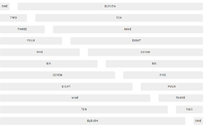
- Content goes inside rows and columns. We use div tags and add classes to the divs to create rows and the number of columns we want to use.
- Columns add up to twelve. Example: 4 sections 3 columns wide; 2 sections 6 columns wide; etc.
- Please open Notepad++, download this code, and copy and paste the code into a new Notepad++ file.
- Save the file as skeleton1.html. MAKE SURE YOU SAVE IT INSIDE THE SKELETON FOLDER ON YOUR DESKTOP!
- Please launch your page in Firefox
- Question: what would happen if you saved your Skeleton page outside of the Skeleton folder on your desktop? Why?
- Let’s review the code you have
- Question: why do I have the background color and border CSS inside the HTML? How else can you change the CSS?
- Let’s open Skeleton’s style sheet and check it out.
- Together we will add another row below the header that includes two sections, each one six columns wide. What happens if we change one of our column classes from six to one-half? Why?
- Question: What happens when we shrink the browser window? Why?
- To do:
- Please add another row below the one we just added under the header. This row should contain two columns, one that is two-thirds and one that is one-third (see here for an example right below the grid). Does this look the same or different than your eight and four column row? How does this work?
- Go here and see if you can add buttons to one of your column sections. Add a white button and a blue button. Why do the buttons look like this? Where is the style coming from?
- Launch your Skeleton page in Firefox and go into Responsive Design Mode. See what happens to your page at each breakpoint (Skeleton’s media queries): Desktop HD: 1200px, Desktop: 1000px, Tablet: 750px, Phablet: 550px, Mobile: 400px. If you can’t get your screen to those values easily, you can simply click inside the bar with the pixels and type in the number you want.
- Coming up tomorrow: You are going to create an entire page on your own with Skeleton just by following a visual example.
