Today’s Goal:
- Solve a responsive web design problem
Today’s featured website:
- https://www.webdesignerdepot.com/– A useful site with lots of tips and resources for web development
Scholarship Alert!
- The MHS Alumni Association is offering 3 scholarships- deadline is May 1 & details are on the MHSAA website
Responsive Web Design Problem
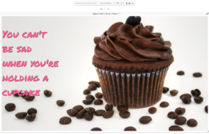
How can you re-design a webpage with a large background image for a small screen?
- You are going to change how this webpage looks on a small screen
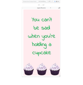
- You will make something similar to this
- Download starter code
- You must do the following:
- Choose a pixel width for the media query
- Choose a smaller image for the background image and figure out how to position it
- Change the Google Font for the small screen and change the font size (should the font be larger or smaller for the smaller screen?)
- Change the background color and the text color to make sure your text is still readable on a smaller screen
- Launch your site in Firefox and put it in Responsive Design Mode to help you choose a pixel width for your media query and to see how your design looks on a small screen. Can you read the text over the background image? Do you need to make the text bigger or smaller? Do you have to change the text color or background color? Do you need to change the line breaks in the quote to fit the smaller screen better?


