Today’s goals:
- Continue learning about flexbox, a flexible CSS layout technique, by completing an online tutorial
Today’s featured website:
- https://onlineclock.net/bg/xmas/– Relax in front of a (virtual) fireplace!
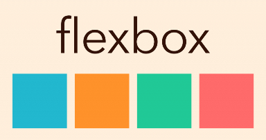
Flexbox (or flexible box)
- About
- Flexbox is a one-dimensional layout method for laying out items in rows or columns. Items flex to fill additional space and shrink to fit into smaller spaces (Mozilla MDN). It’s often used in responsive web design.
- To use flexbox, add display: flex; to your style sheet. Flex is one of the many useful values of the display property. The display property changes how the browser displays content. What are the three display values we recently learned?
- Let’s see some of its properties in action here: http://the-echoplex.net/flexyboxes/
- Summary
Use display: flex; to create a flex container.
Use justify-content to define the horizontal alignment of items.
Use align-items to define the vertical alignment of items.
Use flex-direction to set up columns or rows.
Use the row-reverse or column-reverse values to flip item order.
Use order to customize the order of individual elements.
Use align-self to vertically align individual items.
(from internetingishard.com)
- Tutorials
- Go to this site and complete each mini-tutorial to practice different flex properties