Today’s goals:
- Learn how to create and style buttons
- Begin animation challenge
Today’s featured app:
- http://speakingpuppy.com/ – The world needs this
Buttons
- Code
- There is an HTML tag that will create a button. We need to use CSS to style the button to change its color, size, borders, etc.
- Buttons consist of two important parts: the visible text inside the button tag and a link that links the button to another type of content, usually a webpage.
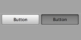
- Examples
- Let’s look at some buttons here
- Notepad++ Practice
- Setup new webpage
- Let’s start a new page in Notepad++ with opening and closing html, head, title, style, and body tags. Save it as cssbuttons.html.
- Set up #wrapper inside the style tags with margin: 0px auto; width: 100%; and height: 100%. Add div id=”wrapper” just below the body tag and add a closing div tag before the closing body tag.
- Basic button and button with link
- Add button tags below the opening div tag and write basic button inside of the tags. What are the default browser styles for a button?
- Add a second set of button tags and write button with link inside of the tags. Let’s add a link inside of the button tags with # as the link source. Put the link code around the text.
- Change the color and style the link
- Let’s add a class called .btn inside of our style tags. Add background-color: yellow; to this class.
- Add .btn a inside of our style tags and add text-decoration: none;. What does .btn a select? Why are we using the text-decoration property?
- Add class=”btn” to the second button we made (the one with the link).
- Change the size
- Add width: 150px; to the .btn class
- Add height: 35px;
- Add padding: 10px; to BOTH the .btn and .btn a classes
- Rounded corners
- Remember the border-radius property ? We can use that to create rounded corners on buttons.
- Add border-radius: 15px; to .btn
- Change styles on hover
- Add .btn:hover to our style sheet.
- Add box-shadow: 3px 4px 6px #888888;
- Add transform: translateY(2px);
- Add cursor: pointer;
- Setup new webpage
Animation Challenge
You are going to practice everything we’ve learned about animations over the past few classes. You will use Animate.css, @keyframes rule and the animation property, and Animista.net.
- Download this code and copy/paste into a new Notepad++ page. Save as animationchallenge.html.
- Animate.css
- I’ve already added the Animate.css style sheet to the code I gave you (see line 8 in your code) so all you have to do is add classes to animate your elements
- Choose any animated class you want to apply to your h1. Go here for the list of choices. Each class begins with the word animated and ends with the class name. Example: p class=”animated bounce”
- Your h1 will only be animated once when the page loads. Make your h2 have an infinite animation by choosing a new animation class in the same way as the previous step but add infinite in the middle. Example: p class=”animated infinite bounce”
- @keyframes rule and animation property
- Make the square change background-color from pink to purple by adding the background-color property in the to keyframe
- Make the square move horizontally 100px by using the transform property (see code example here ). Add the transform property in the to keyframe
- Add the correct animation-name for the .box class and make the animation-duration 5 seconds.
- Make the animation for the square (.box) happen two times
- Make the animation for the square (.box) the same speed from beginning to end and find the right animation property to do that here /li>
- Make the square end up purple and moved over 100px when the animation is over- find the right animation property to do that here
- Add the correct animation-name to the .circle class
- Make the animation-duration for .circle 5 seconds, the animation-iteration-count infinite, and the animation-timing-function linear
- Add the correct @keyframes stages for spin by filling in the ????
- For the 25% @keyframes stage have the circle rotate 45 degrees by filling in the correct value for the transform property (see here for example)
- Make the 75% @keyframes stage the same as 25%
- Animista.net
- You are going to use Animista.net to animate your image
- Go to Animista.net and pick an animation you like
- Modify the animation by using the left menu if you want to change things like animation duration, speed, etc.
- When you have the animation the way you want, click on the curly brackets on the right just above the animation example to get the code. You will see animation property and @keyframes code. Click Autoprefixer to get rid of the unnecessary code.
- Copy and paste the animation property and its values to the img selector in your CSS
- Copy and paste the new @keyframes rule for the animation with the code below your image selector
- Your turn
- Create a new animation any way you want by using either Animate.css, the @keyframes rule and the animation property, or Animista.net. Apply the animation to the content you already have or add new content to animate.