Today’s goals:
- Begin talking about mobile design and responsive design
- Examine responsive webpages
- Learn about different approaches for responsive web design
Today’s featured site:
- https://codepen.io/jkantner/pen/eLMgWa – Something silly to make you smile!
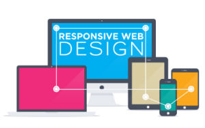
Mobile design
- Questions to explore:
- What is mobile design?
- Why is it important?
- Let’s list of as many devices as you can that would access a website (types of devices and names, like MacBook Pro or Windows Phone).
- What is responsive web design?
- Is www.medfordpublicschools.org responsive? How about www.medfordma.org? How can we tell?
- What are some ways (i.e. tools, methods or frameworks) to make a website “mobile-friendly” (i.e. be responsive or look good on a variety of different screen sizes)?
- What does responsive design look like? Let’s check out some examples here and here
- Quick test for responsiveness of site- let’s check some website and resize the browser window.
- What happens when you adjust the screen size? What style changes do you notice?
Responsive website examples
- In teams of 2 at your tables, you will be asked to examine the 2 websites below on your phone and on your laptop. Write down all of the differences you notice when you view the site on your phone and on your laptop. Differences could include changes in the layout, menu appearance, images or videos, etc.
- https://www.tayburn.co.uk/
- https://www.dallasartfair.com/
- Open Firefox and go to the first website (then do the other 2). Click on the 3 vertical lines (the hamburger) in the top right corner of Firefox. Go to Web Developer, and then responsive design mode. Drag around the bottom right corner of the box to see the changes to your website as the screen shrinks and grows. Try to figure out at what pixel width the design changes.
- Now go to each of the websites on your phone. What differences do you notice between looking at the websites on your phone and on your laptop?
- Finally, find a website that is responsive and a website that isn’t. How can you tell? What did you look for?
Creating Responsive Webpages: Some Approaches
- Responsive web design is the act of making your webpage look good on a variety of screen sizes. There are many different ways to create a responsively designed webpage. We are going to learn a few particular methods and frameworks over the next few weeks. There are many tools and approaches to help create a responsively designed site, some of which you will learn.
- Use the auto value for width and height. What happens when we do this? What determines the width and height when the value is auto?
- Use percentages for margins and width/height values. Why would this approach be more responsive than using pixels (example- width: 50% vs width: 300px)?
- Media queries: changing CSS styles at certain screen widths. Things to consider: when does your design break? What CSS style changes can be made to adjust for certain screen widths? Common changes include the page layout, menu design, and background images.
- Frameworks: We will look at Skeleton and Bootstrap. What are these? Why do people use them?
- New: CSS grid layout and flexbox layout
- Mobile first: the approach of designing your site first for a small screen and scaling up.
- Website vs mobile apps: what is the major difference between websites and mobile apps?