Today’s Goal:
- Start learning about flexbox, a CSS layout method used to create mobile-friendly sites
Today’s featured app:
- https://peteroravec.com/ – Enjoy “walking around” this engaging portfolio site!
Flexbox (or flexible box)
- About
- Flexbox is a one-dimensional layout method for laying out items in rows or columns. Items flex to fill additional space and shrink to fit into smaller spaces (Mozilla MDN). It’s often used in responsive web design.
- To use flexbox, first add display: flex; to your style sheet, and then you can use the flexbox properties (the things you practiced using yesterday playing Flexbox Froggy).
- Flex is one of the many useful values of the display property . The display property changes how the browser displays content. What are the three display values we recently learned?
- Let’s see some of the flexbox properties in action here: http://the-echoplex.net/flexyboxes/
- Summary
Use display: flex; to create a flex container.
Use justify-content to define the horizontal alignment of items.
Use align-items to define the vertical alignment of items.
Use flex-direction to set up columns or rows.
Use the row-reverse or column-reverse values to flip item order.
Use order to customize the order of individual elements.
Use align-self to vertically align individual items.
(from internetingishard.com )
- Working with Flexbox

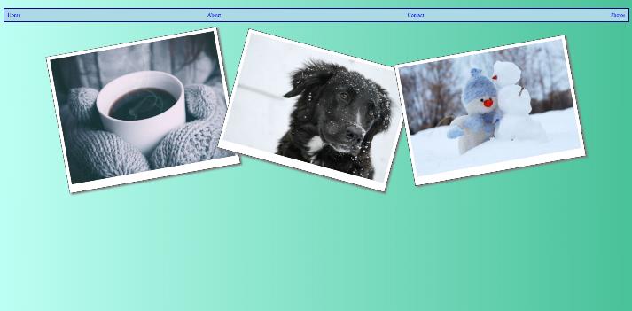
- We are going to make two things with flexbox: a horizontal navigation menu and a photo gallery
- Download this code to begin and copy/paste into a new Notepad++ page. Save as flexbox.html.
- Let’s take a moment to go through the code together to review the CSS selectors and the HTML tags.
- Does anything look weird or unfamiliar (except for the places you need to fill in code)?
- Read the comments for the directions. We will do this as a group or you can work at your own pace.
- Some new stuff:
use of the nav tag to create our menu
code to make our images more responsive (see CSS)
the transform property (we are revisiting this fun property soon!) - Let’s shrink the browser window when we finish fixing the code. What happens? Why?
- Questions:
Why don’t we have to change the display of the images to block, inline, or inline-block? What display value are we using instead?
How is using flexbox different than floats, positioning, and changing the display to block, inline, or inline-block?
